Mobile page speed directly impacts conversions, user experience, and search rankings. A fast-loading mobile site can drive higher engagement, sales, and better visibility on Google. Here's how you can improve your mobile page speed:
- Measure Performance: Use tools like Google PageSpeed Insights and GTmetrix to identify slow-loading elements. Focus on metrics like First Contentful Paint (FCP), Largest Contentful Paint (LCP), and Cumulative Layout Shift (CLS).
- Optimize Images: Compress images, use modern formats like WebP, enable lazy loading, and resize images for mobile screens.
- Streamline Code: Minify JavaScript and CSS, remove unused code, and defer non-critical scripts to improve loading times.
- Enable Caching: Use browser caching and compression (e.g., Gzip or Brotli) to reduce load times for returning visitors.
- Use a CDN: A Content Delivery Network (CDN) ensures faster content delivery by serving files from servers closer to users.
How to Understand & Use PageSpeed Insights to Optimize ...
Step 1: Measure Your Mobile Page Speed
Before making any changes, start by evaluating your website's current mobile page speed. Using reliable tools will help you identify specific areas that need attention.
Testing with PageSpeed Insights and GTmetrix
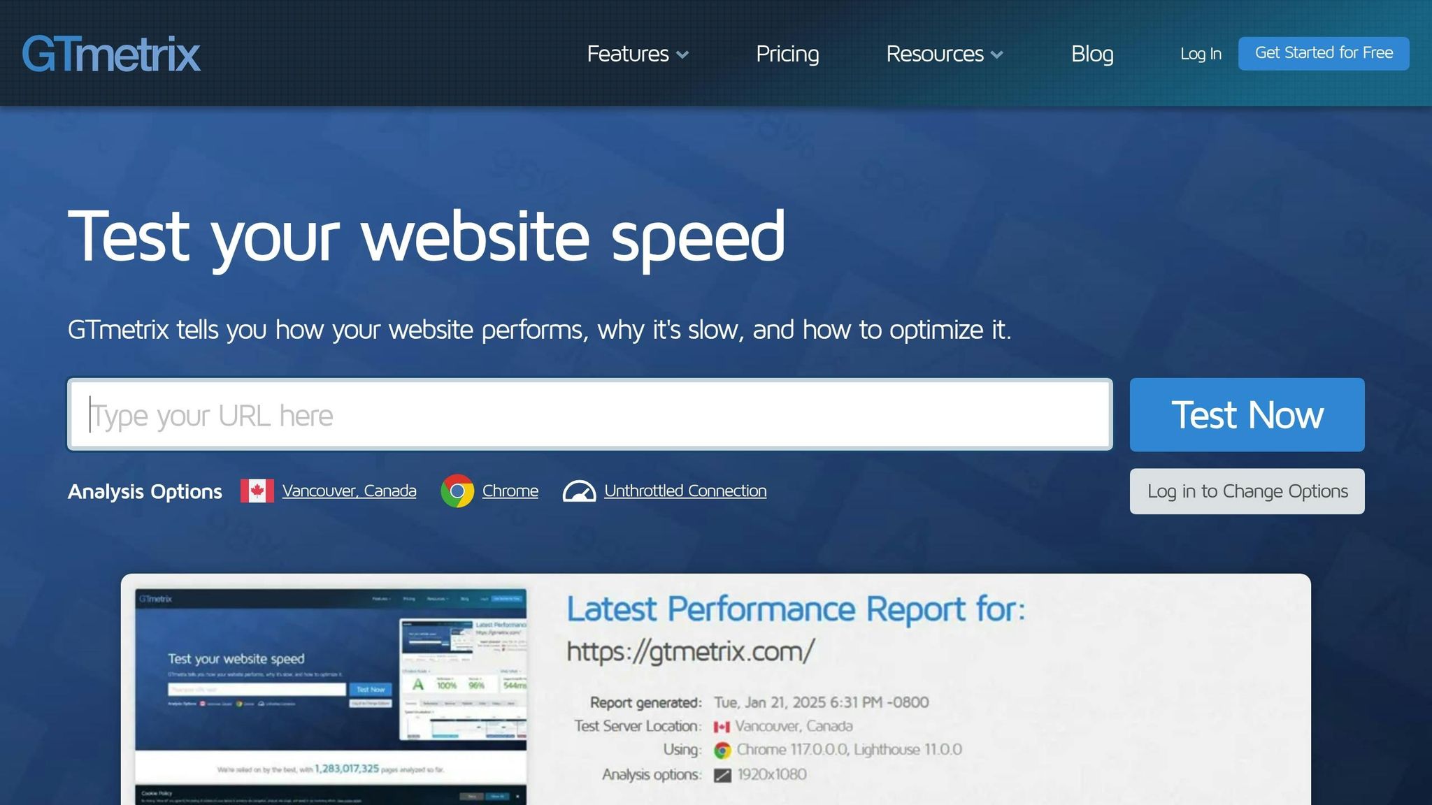
First, use Google's PageSpeed Insights to check your site's mobile performance. This free tool provides an overview of how your site performs on both mobile and desktop devices, with detailed loading metrics.
Here’s how to get started:
- Go to PageSpeed Insights, enter your website URL, and select the Mobile tab for mobile-specific data.
- Review the Lab Data and Field Data sections for a clear breakdown of performance.
- Take note of these initial scores to use as a benchmark.
You can also use GTmetrix, which offers additional insights by simulating how your site loads under different mobile conditions. Pay close attention to metrics like Time to First Byte (TTFB), which measures how quickly the first byte of data reaches the user’s device.
Key Metrics to Understand
These critical metrics will help you pinpoint performance bottlenecks:
- First Contentful Paint (FCP): This shows when the first visible content appears, giving users an initial sense of progress.
- Largest Contentful Paint (LCP): Tracks when the main content - like hero images, product photos, or headlines - becomes visible. It’s a key indicator of perceived load speed.
- Cumulative Layout Shift (CLS): Measures how stable your page layout is during loading. A low CLS ensures a smoother experience without unexpected shifts in elements.
Make sure to document these baseline metrics. They’ll act as a reference point to measure the impact of your changes on user experience and conversions. Once you’ve gathered this data, you can move on to optimizing your site’s speed.
Step 2: Basic Speed Improvements
Once you've measured your mobile page speed, it's time to make some essential adjustments to improve loading times. These steps lay the groundwork for a faster mobile experience.
Optimize Image Size and Format
Efficient image handling can make a big difference in page speed. Here’s how to do it:
- Compress images without losing quality.
- Use modern formats like WebP, which often have smaller file sizes than JPEG or PNG.
- Implement responsive images with the
srcsetattribute to serve the right size based on screen dimensions. - Enable lazy loading for images below the fold by using the
loading="lazy"attribute. - Resize large hero images to match display dimensions and use SVGs for logos or icons.
- Strip unnecessary metadata from image files to reduce size further.
Reduce and Compress Code
Simplify your code to make it load faster and improve parsing efficiency.
JavaScript Tips
- Minify JavaScript to remove extra characters.
- Use the
deferattribute to delay non-critical scripts. - Combine multiple JavaScript files when possible.
- Remove unused code and heavy third-party scripts.
CSS Tips
- Minify and combine CSS files to reduce size.
- Get rid of unused styles.
- Inline critical CSS directly in the HTML
<head>for faster rendering. - Load non-critical CSS asynchronously to avoid blocking the page render.
Enable Compression
Set up your server to use compression methods like Gzip or Brotli. These can significantly reduce the size of text-based assets like HTML, CSS, and JavaScript.
Set Up Browser Caching
Caching can greatly improve load times for repeat visitors by storing assets locally.
Cache-Control Headers
- Set longer cache durations for static assets like images, CSS, and JavaScript.
- Use shorter durations or bypass caching for frequently updated content.
ETags
- Enable ETags so browsers can efficiently validate cached resources and ensure updated content is loaded when necessary.
Local Storage
- Use local storage for consistent data, such as user preferences or static UI elements.
- Apply versioned filenames to updated assets to ensure browsers fetch the latest versions.
After making these changes, monitor your metrics to confirm the improvements. These steps will prepare your site for more advanced technical optimizations in the next phase.
sbb-itb-d7fe25c
Step 3: Technical Speed Optimization
Boost your mobile site’s performance with advanced technical tweaks. After addressing the basics, these strategies can help you achieve even faster loading times.
CDN Implementation
A Content Delivery Network (CDN) can serve your site content from servers closest to your users, cutting down load times significantly. Here’s how to make the most of a CDN:
Select the Right CDN Setup
- Use edge servers located within 50ms of your audience.
- Enable automatic failover to maintain uptime.
- Turn on HTTP/3 for quicker connections.
- Apply dynamic compression at the edge.
Fine-Tune CDN Settings
- Set up automatic cache purging.
- Install proper SSL/TLS certificates.
- Configure browser cache headers.
- Use origin shielding to protect your server.
Eliminate Loading Delays
Speed up your site’s initial render by addressing elements that slow it down:
Optimize JavaScript
- Shift non-critical scripts to web workers.
- Split large code bundles into smaller chunks.
- Use dynamic imports for route-specific code.
- Schedule non-essential tasks with
requestIdleCallback().
Improve the Critical Rendering Path
- Inline critical CSS directly in the
<head>tag. - Defer non-essential third-party scripts.
- Remove render-blocking resources.
- Use hints like
preconnectanddns-prefetchto speed up connections.
Prioritize Resources
| Priority Level | Resource Type | Loading Strategy |
|---|---|---|
| Highest | Critical CSS | Inline in head |
| High | Hero images | Preload |
| Medium | Below-the-fold content | Lazy load |
| Low | Analytics | Async load |
Once blockers are removed, you can take performance even further by implementing AMP.
AMP Page Setup
Accelerated Mobile Pages (AMP) are designed for lightning-fast mobile load times. Here’s how to get started:
Steps to Set Up AMP
- Create AMP-specific templates.
- Validate your AMP markup to ensure compliance.
- Configure analytics tracking for AMP pages.
- Set up proper canonical tags to link AMP and non-AMP versions.
Use AMP Components
- Leverage built-in AMP elements for better performance.
- Use
amp-imgfor responsive images. - Add
amp-analyticsfor tracking user behavior. - Include
amp-formfor interactive features.
Key Practices for AMP
- Keep AMP pages lightweight for faster loading.
- Use ad formats optimized for AMP.
- Add structured data to improve search visibility.
- Ensure content matches between AMP and non-AMP versions.
Ongoing Speed Management
Once you've improved your site's performance with technical fixes, the work doesn't stop there. Keeping your mobile pages fast and responsive requires constant attention and adjustments.
Tools for Monitoring Speed
To keep an eye on your mobile site's performance, use tools like Google Analytics to track key metrics and PageSpeed Insights for specific improvement suggestions. Regularly checking these tools helps you catch any slowdowns early, ensuring your site stays quick and responsive. This kind of routine monitoring helps protect the performance gains you've already achieved.
Prioritizing Mobile-First Design
Monitoring alone isn't enough - your site's design needs to adapt to changing conditions. Focus on a mobile-first approach by routinely optimizing images, cleaning up your code, and evaluating third-party tools that might slow things down. These steps keep your site fast, user-friendly, and ready to convert visitors into customers. Consistent updates ensure your mobile pages stay efficient and engaging.
Conclusion: Speed Optimization Results
Improving mobile page speed not only enhances user experience but also drives higher conversions and contributes to business growth.
Small Business Speed Tips
Small businesses can see noticeable improvements by focusing on simple actions like compressing images, reducing unnecessary code, and using caching effectively.
"Jeremy was flexible, knowledgeable, and actionable. He walked me through steps I should update including adding reviews and updating my email marketing to a different provider. Jeremy sat alongside me as I implemented many of these changes, he also took the time to create a few flows for me as well."
If you need extra help, professional optimization services might be worth exploring.
BrightSide SEO Services
BrightSide SEO specializes in boosting mobile speed and driving long-term results through expert optimization techniques. Their strategies have helped Shopify store owners achieve over 30% sales growth by focusing on targeted improvements.
"I have nothing but great things to say about Jeremy. He is an ambitious, creative self-manager who delivers real value for business and those he works with. His unique skills and insights for SEO and SEM provided a great value in helping grow our brand awareness and sales conversions within the highly competitive consumer product gaming market."
Here’s a quick look at what BrightSide SEO offers:
| Service Component | Benefits |
|---|---|
| Technical Audit | Pinpoints speed issues and prioritizes fixes |
| Schema Optimization | Boosts search visibility and improves click-through rates |
| Performance Monitoring | Keeps track of speed metrics and ensures continued performance |
| Conversion Optimization | Turns faster load times into increased sales |
With a clear, structured approach, BrightSide SEO helps businesses consistently grow. Their clients often report steady 15% increases in email list growth by combining organic and paid strategies.